 PKR (Rs)
 USD ($)
Do you know what can take your profits up to a notch?
A well-designed business website!
Your site’s design has the power to create a good impression on users and further, provoke them to take the desired action. This brings more leads and conversions right to your doorstep!
Unfortunately, web designs are not easy to master! That’s why, business owners keep on committing some fatal mistakes, hence, pushing the potential customers away and dropping their sales.
Is this what you want? Of course not!
That’s why we have listed 6 fatal web design blunders that every website owner should avoid in order to increase sales, leads, traffic, and much more.
So, without further ado let’s get into this...

6 Common Web Design Mistakes That Can Hurt Your Business
Websites with next-level web layouts have an edge over the other ones. To be precise, a well-designed website provides a sensational user experience and attracts tons of customers. As a result, helping you to stand out easily in the ever-evolving digital arena!
But, none of this can happen if you don’t stop committing these mistakes:
- Missing Responsive Design
- Using Unclear or Too Many Fonts
- Cluttering Up Excessive Content
- Using Terrible Call-To-Actions (CTA)
- Uploading Low-Quality Images
- Adding Excessive Pop-ups
1. Missing Responsive Design
Years back, big screens and desktops were super-popular for browsing. So, the web designers only had to focus on creating desktop-based layouts.
But, the case with today’s modern websites is pretty different!
Apart from just desktops, many other devices like mobile phones, laptops and tablets are being used by internet users for daily search. This opened up new challenges for web designers. Now, they’ve to focus on creating a website that works best on every device.
Wondering how to build a responsive website? Here’re some tips for you:
- Switch from pixels to fuel grids
- Set rules for grids by optimizing website’s different codes i.e., CSS
- Style for both mouse and finger clicks
- Consider condensing the menus into buttons
- Use clear and bold CTA’s that can be easily pressed
- Use tools like Media Queries for adjusting the content as per different screens and resolutions
Remember, websites that are hard to navigate have a poor impact on the visitors, forcing them to bounce out of the website. Thus, don’t miss any points listed above while designing your website.
2. Using Unclear or Too Many Fonts
Using fonts that are difficult to read is one of the common mistakes web designers tend to make.
Such texts and words penalize the visitor’s fluency and make clarity super-difficult.
So, if you’re serious about providing an ideal user experience to your audience then better follow the tips below:
- Use easy-to-read font styles and avoid handwritten scripts
- Stick with 2 or 3 fonts to look professional
- Minimize character spacing
- Don’t use too cheesy text colors
- Stay away from small fonts!
- Use dark font on lighter backgrounds and vice versa
Further, here’re 4 best fonts for your website:
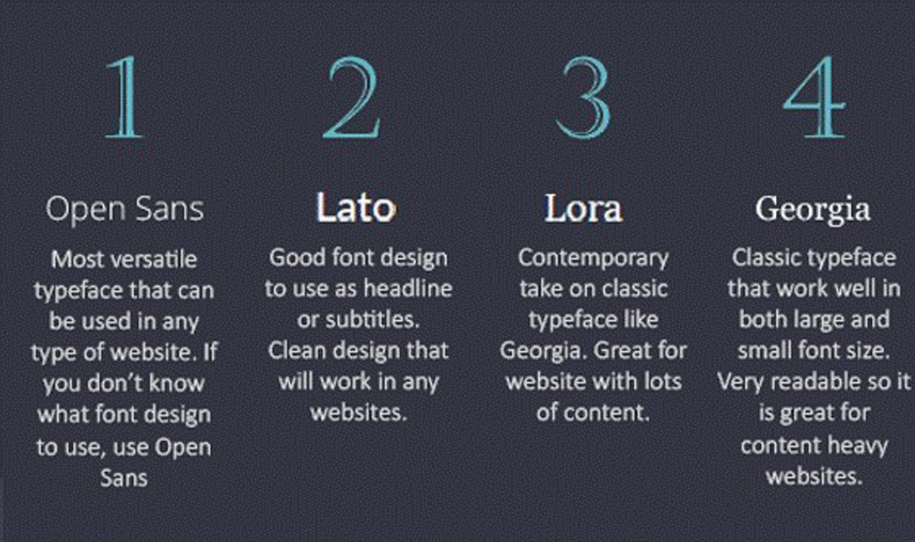
The fonts depicted in the image above are easily readable, making them an ideal option for your website.
While getting web development in Pakistan or wherever else you’re located, font-optimization should be your first priority! Because powerful and clear words can do a lot more than your imagination!
3. Cluttering Up Excessive Content
Now, that you’re familiar with the importance of responsive web designs, let’s talk about the kinds of layouts you should use.
What if you jump into a website that looks like this?
Sure enough, you would move out within the first 2 or 3 seconds.
The same is the case with every user. Visitors would never stay on a site if they fail to understand what it is about.
Don’t forget, simple layouts are the key to success!
Thus, consider getting a structured web design that depicts your content in the best possible manner and try to keep your homepage clean and tidy. Place all the important information right on the front page and use different sections for products or other information.
For instance, if you’re running an e-store you can divide your website into pages of products belonging to different categories, such as women’s clothing, men’s clothing, accessories, about us, etc. This simple tip can enhance the user experience and even convert the passive audience into actual customers!
4. Using Terrible Call-To-Action (CTA)
As your ultimate goal is to uplift the sales of your organization through a heavy-hitting website, using persuasive CTA buttons sounds mandatory!
And, you might even have added tons of CTAs on your web pages but sadly no one is bothering to click on them!
Ever tried to figure out the reason behind this?
Let us help you with that, if your site’s traffic is not converting then probably your CTAs are:
- Hard to find
- Not optimized for all screens
- Depicted through poor colors
Remember, terrible CTAs cannot build curiosity in the hearts of your audience. For example, simple phrases, such as “SSL certificate”, “domain name”, are not-so-cool CTAs.
You have to be clear about what CTAs are referring to, are they pointing to some details of a deal or any discount?
Don’t leave your users making up assumptions on their own. Provide them with clear, direct, and provoking CTAs, i.e., “Sign Up Today”, “Download Now”, etc. So, they can click right after reading them.
Here’s is how CTA’s should look like on your pages:

Don’t bombard your page with tons of CTAs at a time. Further, make sure to use a perfect color combination and easy-to-navigate buttons.
5. Uploading Low-Quality Images
Images are an integral part of your designing progress. Thus, overlooking the importance of adding enthralling visuals to your web page might turn off your visitors.
So it’s best for you to conduct your own photoshoot. Apart from this, you can also upload high-quality stock images. No matter, what option you want to choose, just make sure your chosen pictures are relevant.
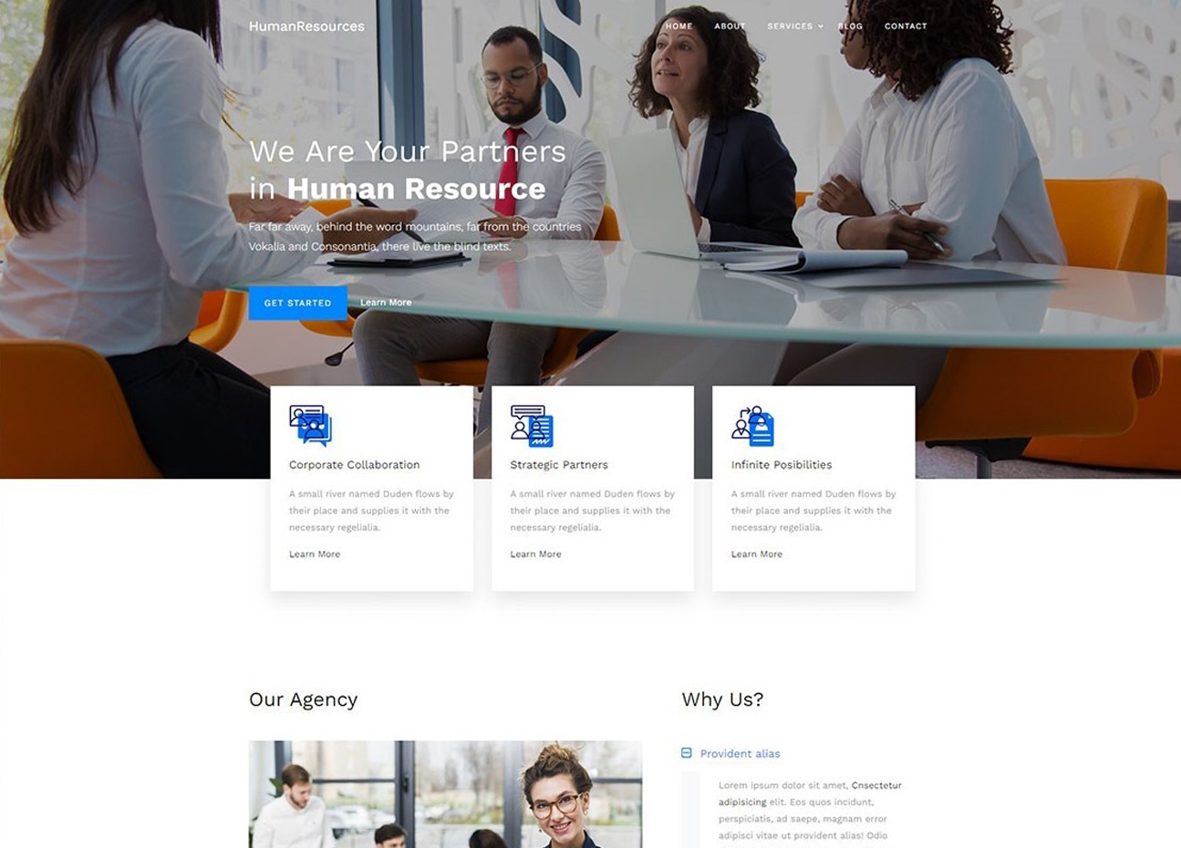
It is highly recommended to select images with faces. This allows the users to create a realistic environment where they can easily drive their attention towards a common point of interest. Here is a good example:
The size and scaling should also remain on the top of your mind while adjusting images on your web page. It’s best to scale images with a one-to-one ratio for both vertical and horizontal dimensions.
Remember, using heavy images can adversely affect the speed of your website. That’s why, choose files like PNG, JPEG, GIF, etc. Because they are light weighted and won’t stop your website from loading at a fast speed.
Apart from that, don’t forget to add alt tags to help search engines learn more about your site. You can also hire an SEO agency along with web designers and let the experts manage your ranking and web layouts like a pro!
6. Adding Excessive Pop-Ups
You would be surprised on hearing that pop-ups receive a 11.09% conversion rate! Isn’t it incredible?
With the help of these pop-ups, you can take your site’s retention to the next level!
But, wait…
Does this mean that adding more pop-ups into a website can drive more conversion?
Well, the answer to this question is a big no!
Users don’t like the sudden arrival of messages asking them to support or subscribe to your site. They not only annoy your audience but also deviate their attention by blocking content.
Much worse? The poorly designed pop-ups look terrible on portable devices and can damage the company’s reputation if used carelessly.
However, pop-ups have become a powerful thing in today’s online marketing. But, using them in the right way is much more important.
Thus, don’t ignore any of the tips listed below while adding pop-ups to your site:
- Don’t block your content
- Add pop-ups into the white spaces of your site
- Use sticky bars for special offers
- Focus on the right timing and use responsive pop-ups
- Use “X” button for easy exits
- Avoid showing pop-ups soon after the user starts browsing
- Don’t shy away from being creative
Your website is your business’s most important asset, so after choosing the best web hosting company pay close attention to your site’s design. Remember, even a single glitch in your design can cost you a huge amount of audience!
So, avoid all the mistakes discussed above and get your hands on the best web design and development agency, and let them design a pro-level site for your brand!

Shanawar Butt is Websouls' WordPress whiz, with more than 5 years of making websites work wonders. He's got a toolbox full of tricks for every WP challenge and a smile for every problem. Shanawar's the guy who turns the complex world of WordPress into a walk in the park for everyone. Follow him on LinkedIn.