 PKR (Rs)
 USD ($)
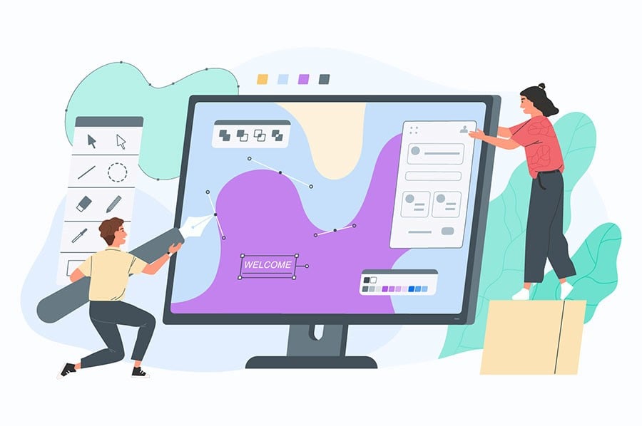
Have you ever thought about how you can design your website for your business? Are you looking for the best web development services in Pakistan? Or, are you planning to start your own web design business and want to know what needs to be done?
This article covers a few dos and don'ts for website design. If you're designing a website for your business or for any other purpose, then read this to get some insights on how it can be done.
Before you begin designing your website and began looking for the best web hosting services in Pakistan, it's important to understand the purpose of your website. This can help you in knowing what type of design will make the most sense for your business.
The 5 Do’s of Website Design
1. Easy Website Navigation
It is a crucial aspect of website optimization, since your website’s job is to help visitors find what they’re looking for.
If your website is easy to navigate and understand, it’ll make it easy for your visitors to understand your business and make a purchase if you have an e-commerce store.
Let's start with what not to do. You might think your site is optimized for UX with a left-aligned menu that's easy for users, but it's not where you want the visitors to go.
You'll want to use top-level menus that help visitors figure out their options faster. Then shorten up how long each section is by limiting your top-level navigation links to a maximum of seven choices.
The number of objects an average human can hold in working memory is 7 ± 2. Design your navigation links in a way that allows visitors to navigate your site with the fewest number of clicks possible.
2. Changing the Color of Visited Links
When it comes to navigation, changing the color of visited links can go a long way. It lets visitors know where they are and eliminates any confusion about repeatedly visiting the same pages.
All in all, your users would thank you if they can know what they’ve already seen on your site and what’s left to view yet.
3. Consistency of the Interface
One of the top principles of a good UX is to keep the interface consistent across all different product's various interfaces.
This means that the overall look and feel of your website should be consistent across all different pages and formats on your website.
Making sure you have consistent navigation, color schemes, typefaces, and style is critical to a website's usability. This helps make it more user-friendly.
4. Easy-to-Scan Pages
Call-to-action buttons and text should be in places that are easy for you to see, like on your website.
Make sure your pages are easy for visitors to navigate and complete a suggested task or find what they're looking for.
Designers can help machine-learning software by designing a good visual hierarchy on the website. Visual hierarchy refers to where the eyes should focus first, and where you then direct them.
5. Test Your Design
Just like you test the quality of your web hosting services before purchasing a web hosting plan, you need to test your design as well. Check how your customers react to it instead of simply just trust your gut instincts on what works and what doesn't.
Check out customer feedback. An unbiased user's feedback is essential in determining the effectiveness of your website.
Although getting one or two people to interact with your site may not be easy--you can still get them involved with a pre-made survey.
Analytics are powerful tools designed to help you find areas on your site that reach, exceed, or fall short of your company's targets.
Tracking these key areas will ensure the success of your website and help keep it up to date.
The 5 Don’ts of Website Design
1. Do Not Open Internal Links in New Tabs
Users expect different behaviors from internal and external links.
You should consider opening all links in the same tab to avoid disrupting users' workflows with extra clicks.
Also, provide an advanced warning to avoid any inconveniences. This may be added as text on the link like "via a new tab."
2. Don’t Overdo the Promotion
It can be hard to know how to balance your marketing efforts on a page without overwhelming your readers. For instance, if you have an offer going on your website development services in Pakistan, don’t publish it so immensely on your website that the users are unable to locate your other services.
If you have too many ads on the page, then your readers will end up ignoring most of them when looking for content.
Banner blindness is one of the factors that can contribute to a website not engaging users properly.
This happens when users are bombarded with too much information and none can grab the viewer's attention.
3. Don’t Hijack Scrolling
Scroll hijacking occurs when designers change the scrolling behavior of a website, making it perform actions that are unexpected for the users. This won’t happen most probably if you’re working with a company that provides reliable web development in Pakistan.
It may look very different from what most people are used to, and such unexpected changes are often irritable for users, causing them to leave the website.
Moreover, scroll hijacking is not only visually unappealing and irritating for your users, but can also clutter up a website or app.
Besides, users tend to like being able to control their browsing on websites and have the ability to change positions whenever they want.
4. Don’t Use the Horizontal Scroll
Wish to know how to keep your site from appearing too boring and plain?
A popular tactic is to add in different types of scrolling.
However, be careful when using this method, as users tend to react negatively more often than not.
This is because most users are used to scrolling down on websites, which is the opposite of what they should do.
So, users tend to ignore content accessible through horizontal scrolling, but they can also look left and right while scrolling and in doing so, discover content.
5. Don’t Use Blinking Texts or Ads
For best results in your animations, it is recommended that you avoid flashing or flickering effects, even if a web development company recommends it.
Such effects may be distracting for regular users and may also put someone with epilepsy at risk for seizures.
This is why it’s important to be aware and make sure you know how to avoid effects like this.
The Impact of Social Media on Mental Health Social media has been an effective tool for connecting people all over the world, but it hasn’t been without its disadvantages.
With websites becoming more advanced, people expect them to comprehend their needs.
If you are unable to satisfy any of their demands, they will simply move to your competition.
This might be a one-click away!
At all times ensure the visitor is always in the foreground while improving your site. And you can get help from web development company in Pakistan to make sure the design of your website is up to the mark.
Plus, if pleasing your website visitors is the goal, don’t forget to get the best web hosting services in Lahore, Karachi, or wherever else you live. Also, learn how you can build the website of your dreams to make sure your business website works at its best.

Shanawar Butt is Websouls' WordPress whiz, with more than 5 years of making websites work wonders. He's got a toolbox full of tricks for every WP challenge and a smile for every problem. Shanawar's the guy who turns the complex world of WordPress into a walk in the park for everyone. Follow him on LinkedIn.